The Samek Art Museum is fortunate to possess a large and varied collection of works of art on paper, comprising prints, drawings, and photographs. These works were mostly acquired by the museum in the 1960s and 1970s as donations from generous alumni or by purchase. The Samek’s collection is actively used in teaching and research by faculty and students at Bucknell University, as was the case here.
During Spring semester 2020 a group of students enrolled in my course Museums, Galleries, Curators embarked on an exhibition project as part of the course’s educational objectives. Having chosen artworks from the collection, students studied the artists who created them and the themes they depict. Students consulted the art historical scholarship about each work and researched the historical context in which these works were made and which they reflect. We also focused on the importance of the artworks within each artist’s oeuvre. The criteria of selection from the Samek’s collection were highly subjective; each student chose two works that she or he was most interested in learning about. Despite the subjectivity of our choices of artworks, the resulting exhibition nonetheless shows prints and photographs that span nearly the entire history of printmaking during six centuries in Western Europe and photography in Europe and the United States, extending from an early woodcut of 1511 by the great German printmaker Albrecht Dürer to a print by the contemporary New York artist Kiki Smith. The periods of greatest innovation and the greatest masters in the history of Western printmaking are well represented by characteristic works. For example, the woodcut by Dürer and the etching by Rembrandt displayed here are considered to be among the finest works ever created in these mediums.
Professor Christiane Andersson
ARTH 103 in Spring 2020
Marcantonio Raimondi
Martyrdom of St. Cecilia, ca. 1520 – 25,
Engraving on paper
1982.15
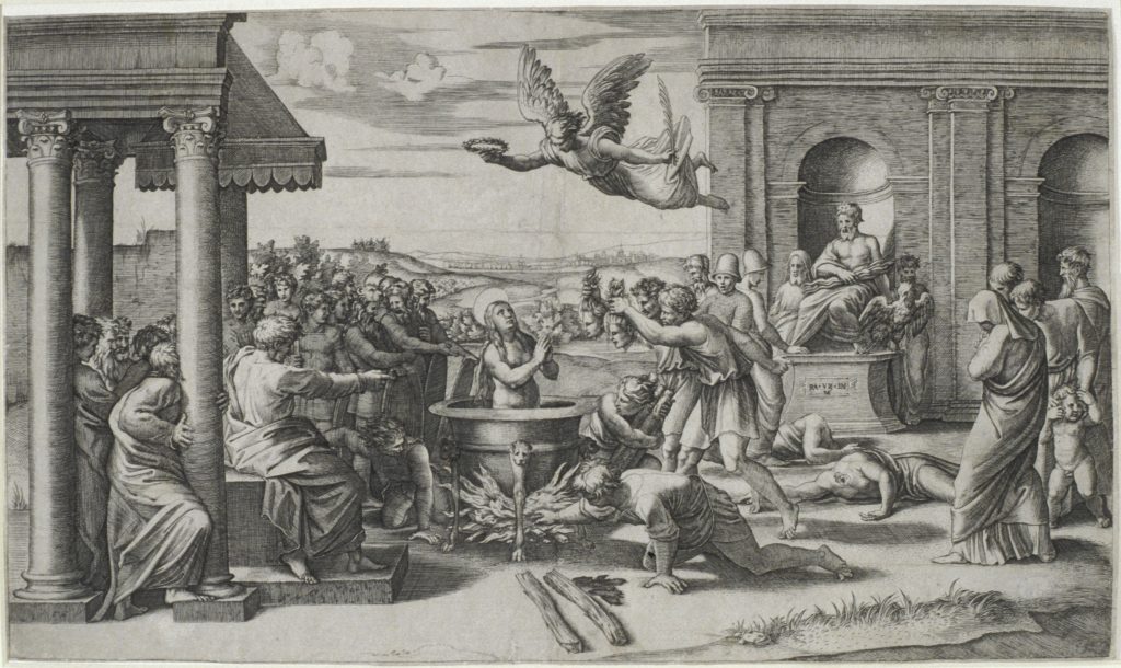 Marcantonio was one of the most influential printmakers of the Renaissance. While he helped establish engraving as a reproductive medium, and his prints stem from the work of others, they are not reproductive in the typical sense of the word. Many of the prints by Marcantonio were worked from preliminary drawings rather than the finished works. This allowed him to create compositions with considerable amounts of liberty, thus making his work more interpretive than reproductive.
Marcantonio’s Martyrdom of St. Cecilia engraving relates to a fresco designed by Raphael and commissioned by Pope Leo X for the chapel of the Villa Magliana outside of Rome. This papal retreat was built on the land the martyrdom was said to have occurred. Despite the existence of the fresco, Marcantonio’s engraving was based upon a finished wash drawing completed by Raphael. The scene in the engraving combines the martyrdom of St. Cecilia, who was boiled in a cauldron of oil, with the beheading of her husband and brother-in-law. This drama occurs before an enthroned statue of Jupiter. A certain anxiety is displayed through the repetition of angular, stiff poses, rhetorical gestures, and nondescript head and facial features rather than emotion expressions.
By: Cheyanne Stunger
Rembrandt van Rijn
Christ Healing the Sick (The 100-Guilder Print), 1639 – 1649
Etching and drypoint on paper
1970.3.8
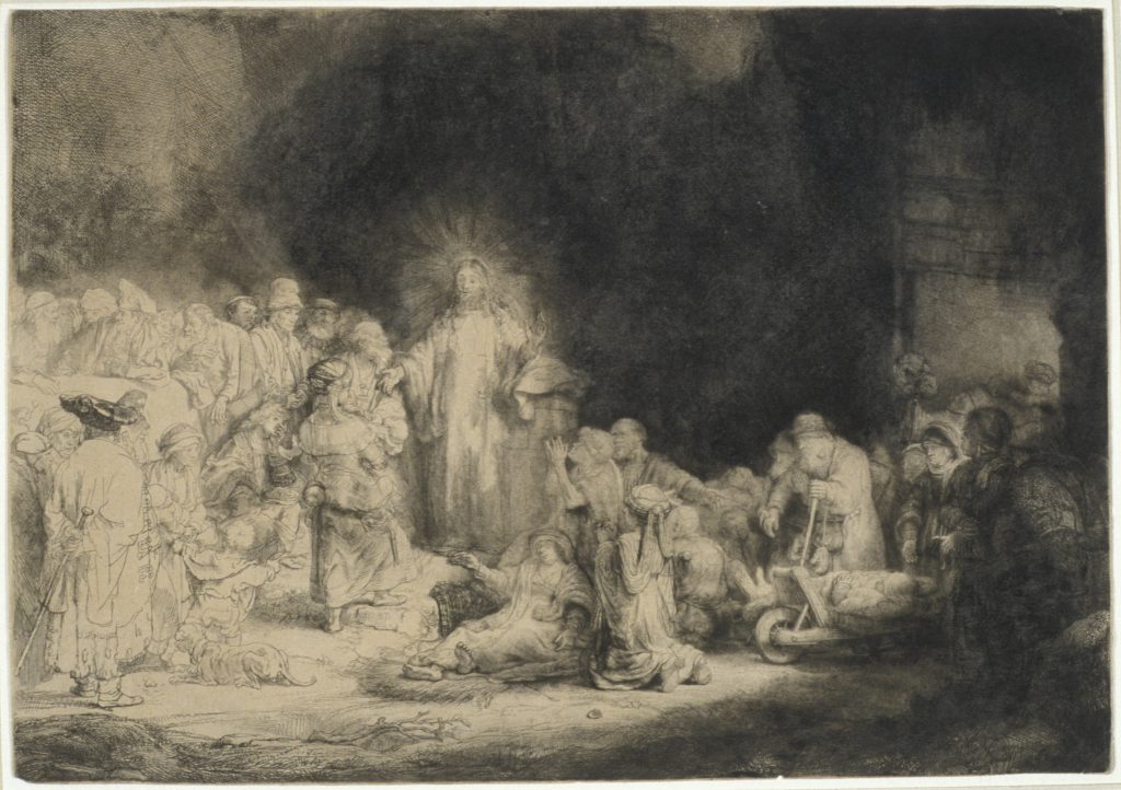 This work from the year 1648 is one of Rembrandt’s most notable etchings. It is also called The 100-Guilder Print. This name comes from the significant sum of money paid for the piece in 1654. This work depicts various Christian stories and events written about in the Gospel of Matthew.
Christ Healing the Sick is considered to be the most moving of his etchings. This is largely attributed to the work’s detailed depiction of human expression. The stylistic choices show the powerful symbolic contrast of light and shadows. The illumination of Christ contrasted by the dark background helps create the dramatic narrative the print tells. The figure of Christ, the focal point of the image is outlined by a soft light originating from the left. The figures surrounding Christ are begging for his attention. Rembrandt is able to portray emotions of the human subjects through small delicate lines. The facial expressions evoke feelings and establish a connection between the viewer and the subjects. The composition is built on contrasts: light vs. dark, rich vs. poor, sick vs. healthy, kneeling vs. standing, adult vs. child, and human vs. animal.
The etching depicts the Gospel of Matthew 19. Christ is highlighted as a preacher, healer, and teacher. The sickly old women kneeling below Christ illustrate his power as a healer to his believers. The camel entering the scene on the right side of the print alludes to Matthew 19:32 (“It is easier for a camel to pass through the eye of a needle, than for a rich man to enter into the kingdom of God”). The rich man (evident by his attire) is seen in the front left of the composition. Christ raises his right hand with his palm faced forward in a gesture of inclusion to the children (in front of him just to his right) with their gazes fixed towards him. This visual is symbolic of Christ blessing and accepting children.
By: Anna Dailey
Giovanni Battista Piranesi
Veduta interna della Basilica di S. Pietro in Vaticano, 1748
Etching on paper
1968.12
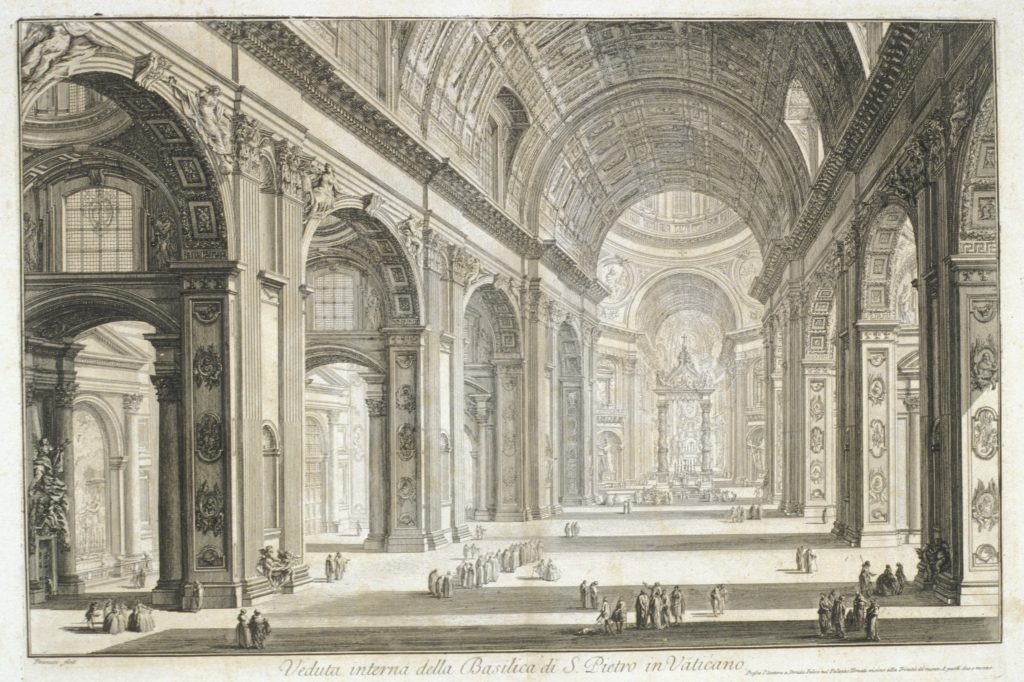 Piranesi was not just an 18th century artist who is famous for his etchings and drawings, but his work and life experience prove that he was an architectural genius who wished to revitalize the way that the world viewed the beautiful city of Rome. In a particular series: Vedute di Roma (Views of Rome), he demonstrates the original architecture, multiform decorative models and landscapes of Rome by using enticing new perspectives and a steady technique. Influences extend from his apprenticeships to Carlo Zucchi and Giuseppe Vasi, to which he learned perspective drawing, set design, business techniques of the publishing trade, engraving and printmaking. Veduta interna della Basilica di S. Pietro in Vaticano is a specific piece in the very series that demonstrates the extreme perspective and scale of Rome’s architecture, and surely creates interest in Rome among all viewers in the past and present.
The interior of St. Peter’s Basilica is depicted using a unique perspective and a scale which is expressed by the groups of people who wander the vicinity. Both help portray the true grandeur of the building, while also showcasing the beautiful windows, mosaics and carefully crafted ornamentals on the walls and ceiling. The extreme perspective of this work and many others, Piranesi states, helps to revolutionize the “manners and spaces in which social life manifested itself.”
By: Madison Kurtz
Giovanni Battista Piranesi
Vedute di Roma (Frontispiece: Fantasy of ruins with a statue of Minerva), c. 1748
Etching on paper
1966.13.2
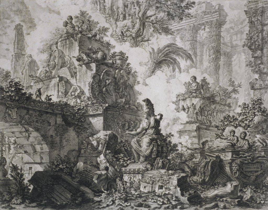 Celebrated Italian architect, etcher and engraver, Piranesi expressed his love for Roman art and architecture through his etchings and engravings, while simultaneously taking creative liberties in his views of Rome. His Vedute di Roma, the various plates of which he worked on for most of his adult life, display his frequent manipulation of scale, and signature style of architectural fantasy. Not afraid to experiment with format, these prints were generally larger than those of his predecessors.
Centered around a statue of Minerva, Piranesi presents a condensed view of a variety of Roman ruins, invaded by the forces of time and nature. Considering its role as the frontispiece, the ruins range from arches to columns, from statues to obelisks, perhaps suggesting the views yet to come later in his Vedute di Roma. References abound to prominent historical and mythological figures, including a likeness of Scipio, noted Roman general, and the head of a bull, an animal sacred to Jupiter. Despite his fidelity to the spirit of Rome, Piranesi brings together individual pieces into this one imagined scene, cluttering together remains that in reality lay apart.
By: Clare Bassano
William Hogarth
The Reward of Cruelty, 1751,
Engraving on paper
1968.19.1
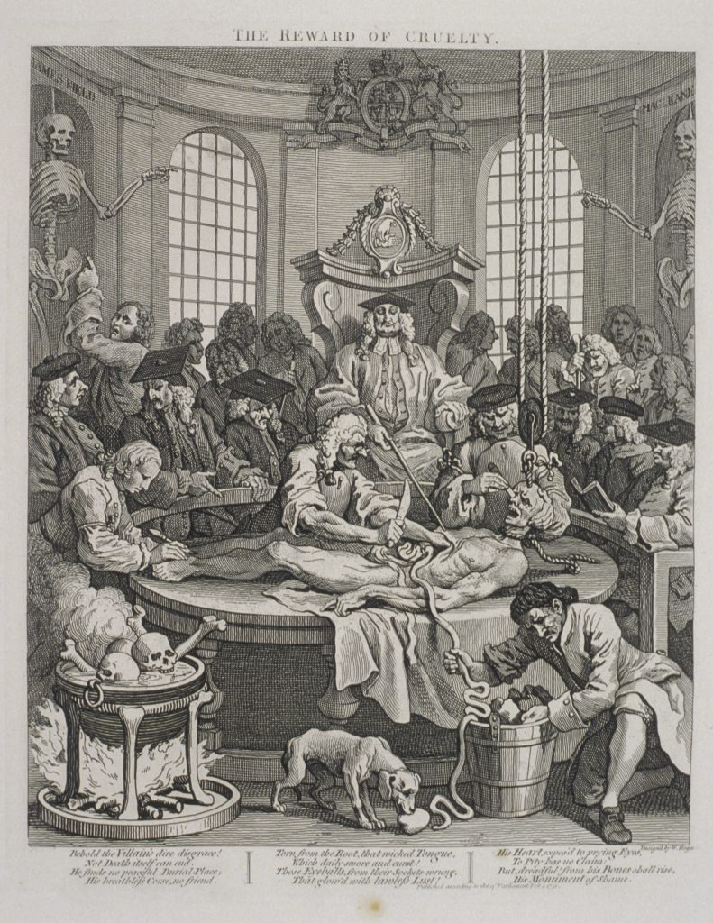 William Hogarth was an English painter and engraver, widely known in his day for his popular satirical prints. Hogarth sought to be respected as a creative artist in a London that saw English graphic artists and painters as merely skilled craftsman. Despite this environment, Hogarth saw financial success and great popularity because of his prints in his own lifetime. Hogarth’s satirical prints cover a wide variety of topics, including the external and internal causes of evil in humanity. His four-print series The Stages of Cruelty follows the life of Tom Nero, an unloved orphan, whose abuse of animals escalates to the murder of a maidservant.
In order to bring his commentary to a greater number of people, Hogarth deliberately etched his plates for The Stages of Cruelty in a rough style, so that they might be sold cheap enough for the poor to buy. The final print in The Stages of Cruelty series, The Reward of Cruelty, shows what happened to Nero, and other criminals like him, after his execution. In addition to the body of Nero being dissected, on the edges of the prints are the skeletons of boxer James Field on the left and highwayman James Maclain on the right. For London buyers in 1751, the execution of these real criminals would have been in recent memory. Nero’s somewhat pitiable depiction in The Reward of Cruelty stands in contrast to his characterization as a brutal criminal in the other prints of the series.
By: Clare Bassano
Ben Shahn
Supermarket, 1957
Serigraph on paper
1980.13
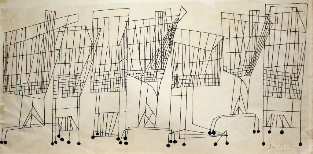 Ben Shahn is an American artist whose works fall under the movement of social realism. Social realism is an art movement in which artists bring to light social-political conditions. Other individuals associated with this moment are Diego Rivera, Dorothea Lange, and Jacob Lawrence. Shahn used his art to spread his left-wing political views on social injustice, immigration and urban life. Shahn is known for his painting, illustration, graphic art, photography as well as writing.
Supermarket is a print with eighty known impressions but the edition size is unknown. Many are black and white like the one shown here while others contain solid blocks of color within the cage of the shopping cart. In the print, there are seven shopping carts all of which are facing in different directions. Supermarket the print is based on a drawing that, along with a few other drawings Shahn created that depict objects associated with American daily life, was a commissioned work for CBS. The original image was entitled The Big Push (1957) and it is a print ad co-created with graphic design artist William Golden.
By: Paige Deertz
Dennis Hopper
Andy Warhol, David Hockney, Henry Geldzahler and Jeff Goodman from the “Out of the 60s” Series, 1963
Two-color photolithograph on satin paper
2008.5
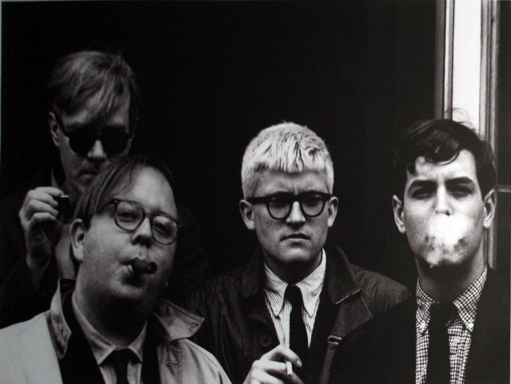 Dennis Hopper is most widely recognized as an actor and director, known for his roles in Easy Rider (1969) and Apocalypse Now (1979). He also began his photography career in the early 60’s, shortly after he began acting. His goal was to document the social scene around him by photographing coworkers, friends, and members of the art scene in New York and Hollywood. This photograph is a part of his Out of the Sixties series, taken by Hopper between the ages 18 through 31and published as a book in 1986. This compilation of photographs by Hopper illustrate the art and entertainment world in the United States in the sixties. The subject matter focuses on political movements, fashion, and trends from Hopper’s unique perspective.
The four people smoking cigarettes in a doorway are three emerging artists- Andy Warhol, David Hockney, Henry Geldzahler, and Jeff Goodman. Andy Warhol and David Hockney were visual artists leading the Pop art movement, which used imagery from marketing and pop culture and redefined what could be fine art. Henry Geldzahler became an influential curator, historian and critic of contemporary art, and Jeff Goodman was a friend of the other three, but is not otherwise known in art history. The first three men were openly gay, and were introduced to eachother on their way to see Hopper work as a guest star on a TV show. This photograph gives us a glimpse into the social lives of queer artists in Hollywood in the sixties.
By: Olivia Sherman
Andy Warhol
Flowers, 1970,
Screenprint on paper
2014.1.2
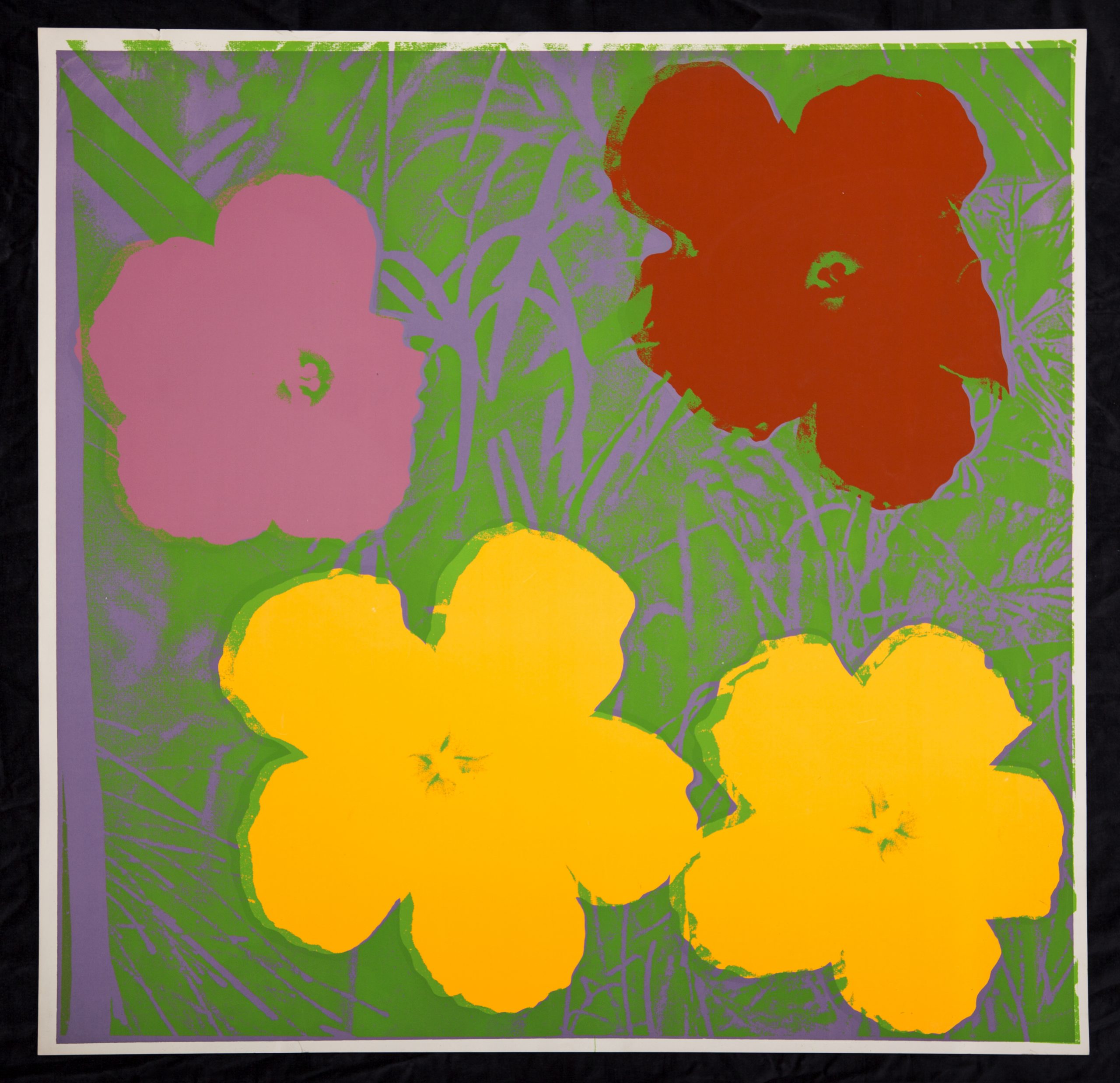
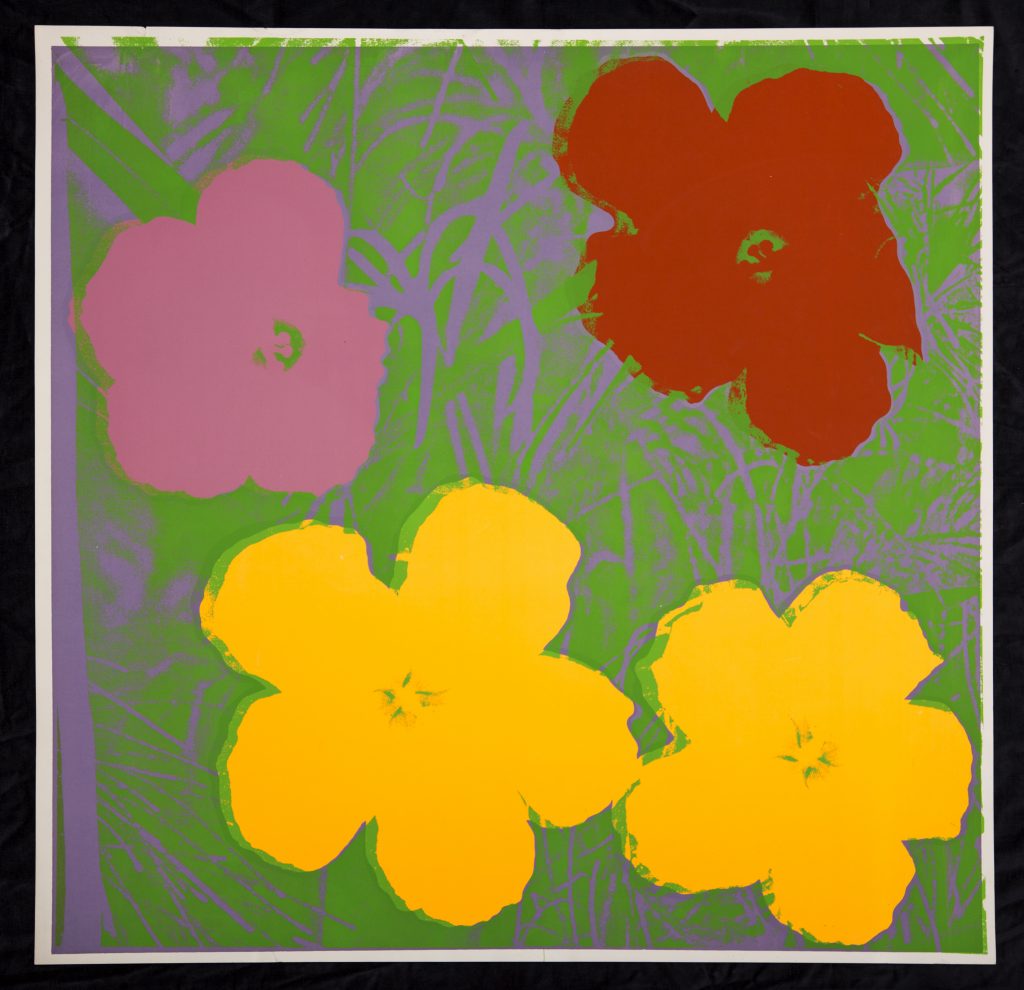 Andy Warhol first became an admired artist in the 1960’s due to his contributions to the origins of Pop Art as well as his unusual artistic process and thought concepts behind his works. Many of Warhol’s works represent his belief in The Machine, which is the idea that during the course of repetitive production, humans lost their sense of individuality and became a part of the mindless production process, making them a part of The Machine. In order to emphasize the mind-numbing condition of repetition, Warhol would often make large quantities of his prints and display them in close proximity. In addition to printing the same image lots of times, Warhol would often paint the paper on which he was printing in different colors, additionally he would purposefully blot ink and allow different phases of the screenprinting process to overlap. By adding variety to each of his prints of the same image, Warhol developed the ability to make his works appear as individual pieces of a greater whole. Flowers was originally inspired by three consecutive images of flowers in a photography magazine, and was used for his exhibition at the Leo Castelli Gallery in 1964. However, the print held by the Samek Art Museum was printed for a different collection in 1970.
This screenprint on paper by Warhol contains the images of four flowers: two yellow, one pink, and one red. The flowers lie on a piece of paper that was entirely painted periwinkle in order to serve as a backdrop for the images depicted. Additionally, a layer of green ink was sloppily laid after the images of the flowers had already been printed, perhaps because the green ink represents the natural imperfection of the movement of grass in a meadow. When the “Flower” prints are displayed in close proximity to one another, it creates the sense that you are in a field full of wildflowers. The imagery of flowers, and more importantly the techniques used to print them, became a staple in the portfolio of Andy Warhol.
By: James Hinchman
Alen MacWeeney
Hens in a Hearse, Mayo, 1971
Endura color print on photographic paper
2008.66.6
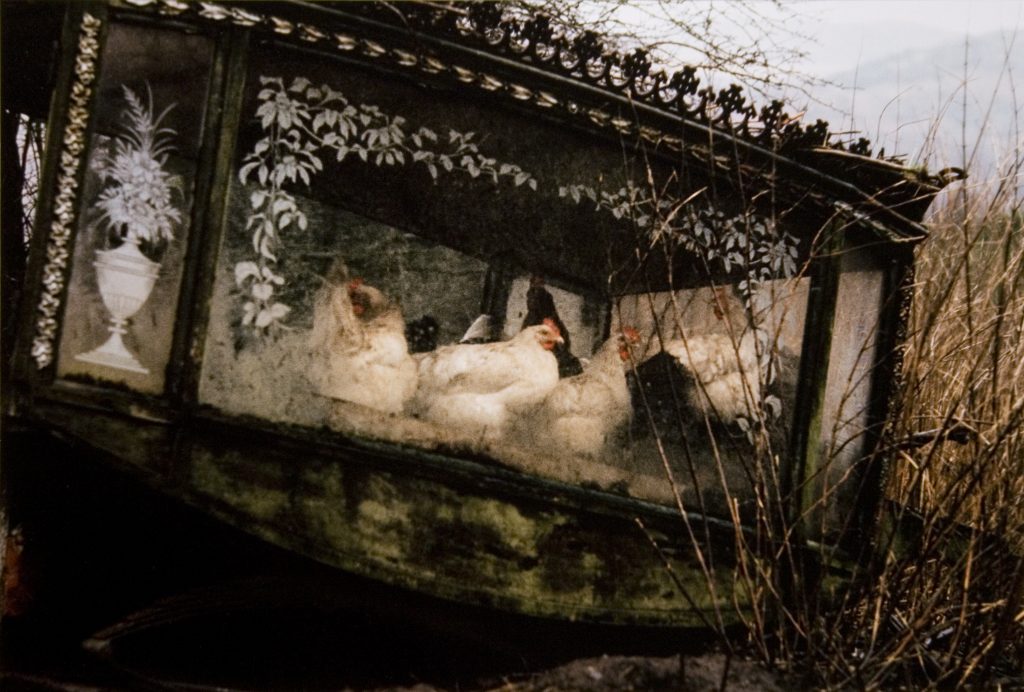 MacWeeney was an impressive photographer of the late 20th century, as well as a notable writer whose work has been published in multiple articles that detail specific aspects of Ireland. In sacrificing his comfortable life to travel with the nomadic people of Ireland known as Tinkers, he has been able to contribute a great deal of documentation to the University College of Dublin. Through the photos he has taken and essays he has written of them, MacWeeney sheds light on the marginalized group’s hardships. The photographs are unapologetic and raw, showing their difficult and impoverished lifestyle for what it truly is. He gives the Travellers a sense of integrity and respectful distance. Hens in a Hearse, Mayo is one of a series: Selected Images of Ireland. The series is a culmination of his work living alongside the Irish Travellers, all taken in different places during different visits.
A rather small group of black and white hens are penned by a delicately crafted glass hearse that appears to have been left in the middle of a field. The hearse is outlined by metal crosses and etched on the glass are hanging greenery and a vase of flowers. The hearse is tilted, having to rest near a tree and surrounded by tall, dead shrubbery. Beyond the foreground, in the top right corner are rolling hills and a dreary grey sky.
By: Madison Kurtz
Helmut Newton
Charlotte Rampling, Arles, 1973
Gelatin silver print on paper
1984.25.3
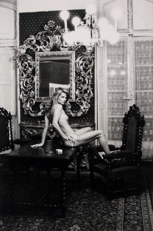 Helmut Newton was a renowned 20th century photographer, recognized for his provocative and erotic photographs of women and men. Weaving art and commerce together, Newton’s photography was undoubtedly both polarizing and unifying. Newton worked for under and with many accomplished photographers during his tenure, one of whom being Els Ernestine Simon, a well-known nude and fashion photographer. Throughout his working relationships with Vogue and beyond, many of his photographs exemplified a film-like quality. This print at the Samek Museum characterizes everything iconic about Newton’s work: sexual, sensual, transcendent, and oppositional.
Charlotte Rampling was an icon of the Swinging Sixties, beginning her career as a model and eventually becoming a well-known film actress. This print shows several notable signature elements of Newton. First, the subject and the setting. Rampling is completely nude, provocatively sitting on a wooden table with her feet on the adorned chair. Newton began his photography with a fascination of familiar surroundings, particularly the Chateau Marmont, the classic West Hollywood style hotel. Although this photo was taken in the Hotel Nord-Pinus in Arles, France, a similar vintage background compliments and supports Rampling. To complicate and heighten his photos, Newton used naked women to juxtapose the stagnant setting. Second, Newton enjoyed pushing the transcendence of time and normality. Newton often wanted the women in photos to be placed in settings that transcend the present and have impermanence, asserting their own existence in defiance of time. Here, Rampling’s youth and sensuality contrast the heavy, old fashioned baroque furniture. Third, Newton’s photographs were notably voyeuristic. With an abundance of sexual audacity from the models, oftentimes wearing lace or silk, Newton wanted the focus of the photo to be the naked body. Rampling is pictured wearing a pair of high heels, further demonstrating the lack of innocence and a strong presence of sexual tension that is undeniably the work of Newton. Through his spirit of curiosity, adventure, and disregard for societal taboos, Newton was able to expand and reconstruct the limits of photography and visual art.
By: Charlotte Rampling
Helmut Newton
Roselyne en Arcangues, 1975
Gelatin Silver Print
1984.25.5
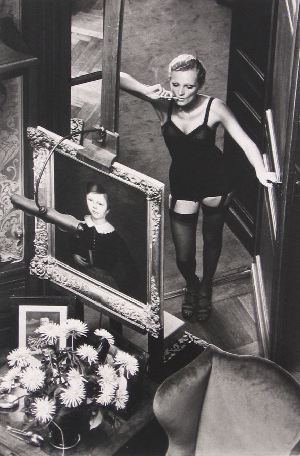 Newton’s Roselyne en Arcangues is from a portfolio of 15 photographs. This image is one of the more conservative of the provocative and erotic collection. The sexualization and exposure of the female body was Newton’s response to the rebellious “sexual revolution” of the ‘70’s in the United States. Newton presented this controversial collection exploring the beauty of the female body. He idealized the female body contrasting the submissive nature of the typical images of the submissive women of an earlier time.
The portfolio of black and white images were shot at Château Arcangues in Arcangues, France for French Vogue. The photograph is shot from above looking down on the model who is dressed in undergarments and heels. She appears to have a cigarette in her mouth and her cheeks bone make it look as if she were inhaling. In the front of the image are two portraits – possibly her child. The chrysanthemums and light around the smaller portrait allude to it as a memorial or shrine. Feminist scholars criticized Newton’s nude for being exploitative of women.
By: Anna Dailey
Andy Warhol
After the Party, 1979
Screenprint on Arches 88 paper
2014.1.4
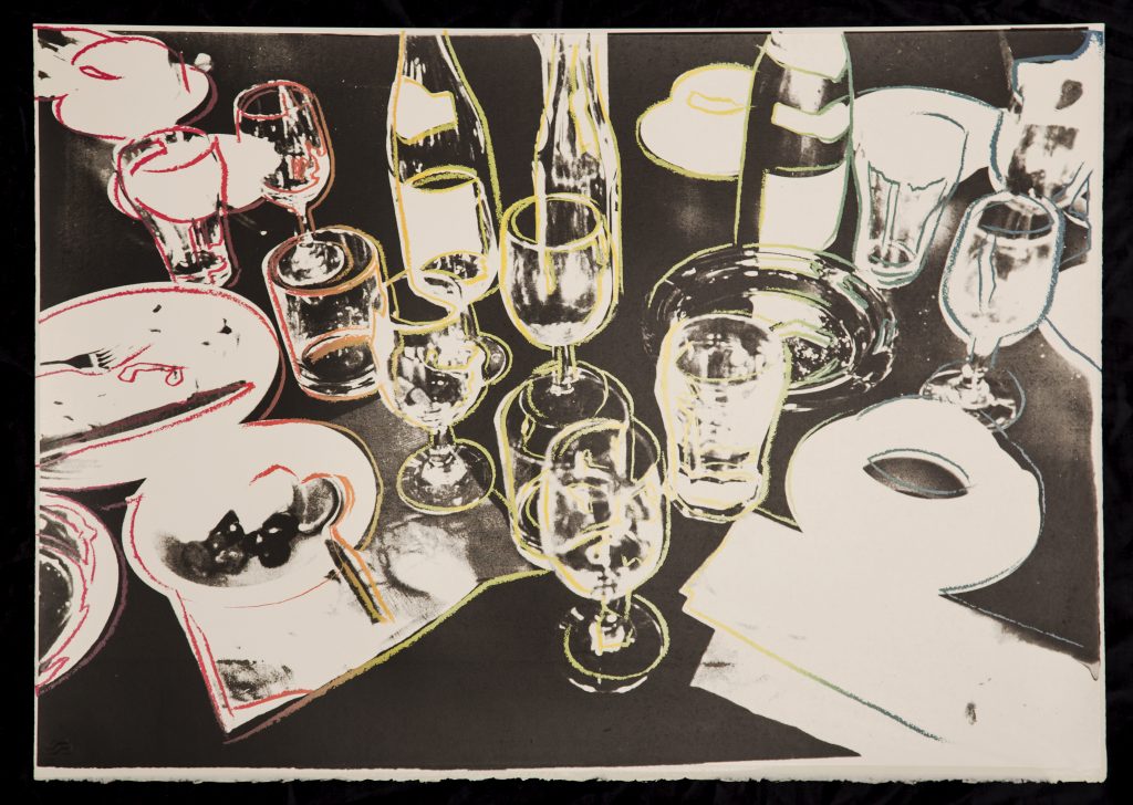 Andy Warhol was an American artist and leading figure in the Pop art movement. In the early 1960s, Warhol recognized the value of using screen printing for his works, and this process became essential in challenging the conception of uniqueness within an individual work. The subject of his works came from mass produced images, as Warhol focused on issues in contemporary society and wanted to reveal the effects of mass produced media on cultural values. As his popularity grew, the references for his subjects began to come from photographs he personally took. These photographs later became the subject of his famous portraits and still lifes.
Warhol’s After the Party screenprint is a still life based off of a black and white photograph. Although the design for this print and the actual photographic reference were created by Warhol, the actual printing for this work was done by Rupert Jason Smith. The scattered array of glasses, wine bottles, cigarettes, and other dishware depicts the aftermath of a dinner party. These items are then accentuated rainbow outlines that animate the scene. This rainbow roll drawing line varies from print to print. The subject of this work provides a glimpse into the abundant partying that occurred at Warhol’s Factory, where most of his prints were created. The haphazard arrangement of the objects, in conjunction with the colorful outlines throughout the print, echo the chaotic lifestyle that Warhol depicted.
By: Cheyanne Stunger
Salvador Dalí
À la recherche de la quatrième dimension (In Search of the Fourth Dimension), 1979
Lithograph on paper
1985.13.7
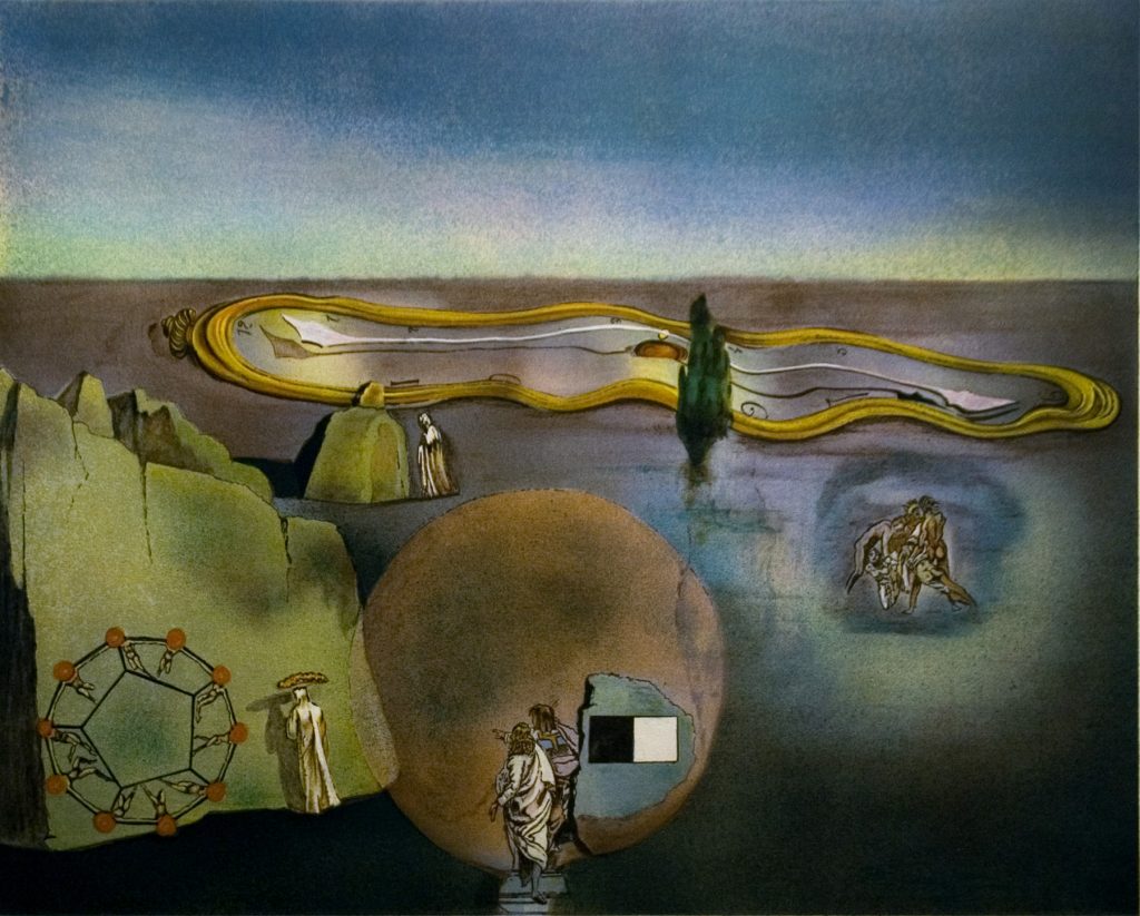 Salvador Dalí, is often regarded as the father of surrealism due to his eccentric portrayals of unusual scenes. Many of Dalí’s works also contain instances of highly metaphorical imagery. Many of his later works contain references made to Einstein’s Theory of Relativity, as well as Greek philosophy. Additionally, his later prints also display representations of modern religion and the indistinctions between reality and another dimension through the presence of geometric shapes and polyhedral forms.
In the background of this print, a large drooping clock covers the landscape, this image is one commonly used by Dalí in order to express the relationship between time and space as an illusion in reference to Einstein’s Theory of Relativity, which describes time and space as an interconnected fabric. Additionally, there is a philosophic reference to Plato’s allegory that life is like being shackled in a cave being forced to watch shadows pass by on the wall. This allusion is made in reference to Dalí’s opinion on modern religion, by placing modern religious figures in the direction of their shadow. This print is one of many presented by Dalí in which the same ideas are portrayed through similar imagery.
By: James Hinchman
Leon Amiel after Salvador Dali
The Great Masturbator, ca. 1980
Lithograph on paper
1985.13.5
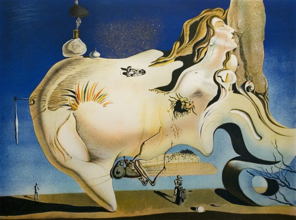 Dali was regarded as one of the foremost surrealist artists. His work embodied the Freudian subconscious mind and represented his inner turmoil in regards to religion, sex, relationships, and the human body. Although this lithograph was created by Leon Amiel, a recognized art forger, its demonstration of Dali’s complexity, expression of Freudian ideas, and signature surrealist qualities are nonetheless authentic and revealing. The original painting currently hangs in the Reina Sofia Museum in Madrid.
As a child, Dali often encountered situations of being shamed or feeling ashamed, from familial discipline to primary school incidents, eventually becoming one of his many themes in his works. . Many are convinced that this painting portrays Dali’s mind when he was 25-years-old with his greatest fears, anxieties, erotic desires, and of course, shames. The large yellow head with its nose facing the ground emulates a rock formation Dali saw in the Cap de Creus bay, near Dali’s family’s summer home in Costa Brava, which many suspect to be a self-portrait. Within the yellow head, there are several scenes of pleasure and fear: the sensual woman’s face in the upper right corner hinting at fellatio, the phallic Lily flower dripping blood, and the disproportionally large grasshopper on the face, a phobia Dali expressed publicly. Each component of the painting contributes to the illustration of Dali’s contradictory and shame-filled anxieties and desires. After Dali passed away in 1989, a market for reproductions became abundantly popular, as Dali’s works are still some of the most valued in the industry to date. Because his works were internationally sought after, Amiel was able to take advantage of this value and create color lithograph reproductions based upon Dali’s authentic works all over the world, especially in Europe, where Amiel resided for much of his life.
By: Erica Chen
Susan Rothenberg
Untitled (Conductor), 1985
Silkscreen on paper
1989.4.11
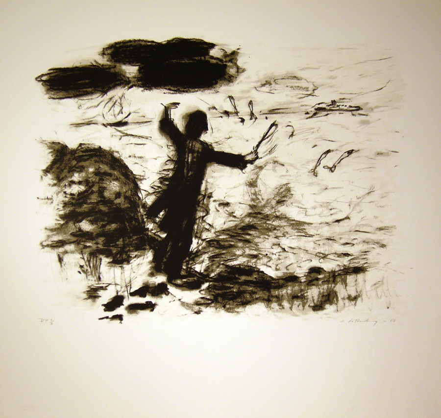 Susan Rothenberg is mostly known for her paintings of horses, usually life size. Her career took off in the seventies, when she became established in the New York art world. Her highly emotional and psychologically charged pieces, with their figurative formal aspects and rough style are considered the best example of a movement called ‘new image painting’ which was popular in the late seventies. Rothenberg’s personal style is always unrefined and intuitive, usually loosely sketched and spontaneously painted. The horses that she repeatedly paints are said to be figurative self portraits, studies of the self through the guise of equine symbolism.
Because part of her painting process relies on intuition and the moment’s chaos, her prints are rare and created unconventionally. She allows each copy of a print to be distinct by encouraging mistakes. This silkscreen in particular looks more like a charcoal sketch than a traditional screenprint. Although she strays from her horse figure with this piece, her autobiographical motif is still at work. The composer, with their back turned to the viewer, functions as a rükenfigur. Seeing the figure from behind, the viewer is transported into the figure’s perspective, perhaps Rothenberg’s perspective. This print was made in 1985 for the Lincoln Center for the performing arts in NYC. This explains the unusual subject matter for Rothenberg’s portfolio.
By: Olivia Sherman
Kiki Smith
Still, 2006
Aquatint and etching on paper
2006.6
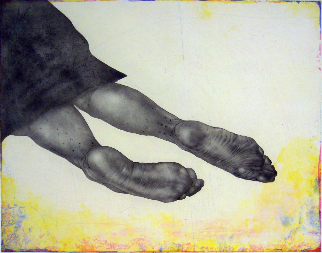
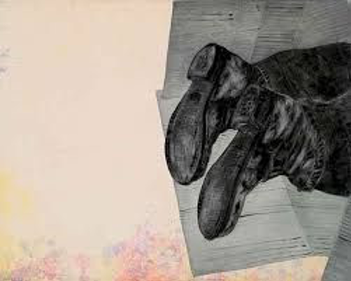 Kiki Smith is a contemporary American artist who focuses on themes of the body, gender, sex, birth and mortality. Kiki Smith is a feminist artist whose work is inspired by political and cultural standards for women. Smith works in the mediums of drawing, printmaking and sculpture. Still was produced in an edition of twenty and was meant to be displayed alongside Smith’s Home as a diptych.
Still is an illustration of the lower third of a female’s body. The body is decorated with stars on the ankles. Kiki Smith often depicts individual aspects of a female’s body and is not new to illustrating feet, a repeated motif she often connects to mortality. In Home, another set of legs and feet are shown, this time with shoes and pants. Rather than lying on the ground like the body in Still, the shoes are lying on paper. Both bodies, black and white, are surrounded by a vignette of color depicting what appear to be oil slicks or rainbows. These two prints are unique to Kiki Smith’s work because she usually works in black and white.
By: Paige Deertz

