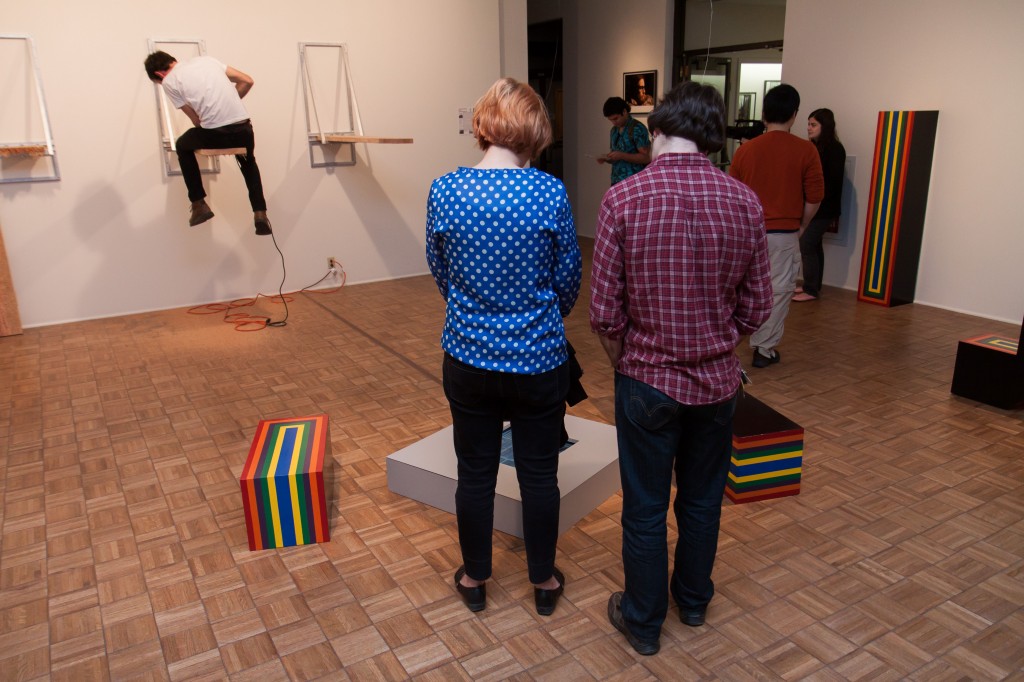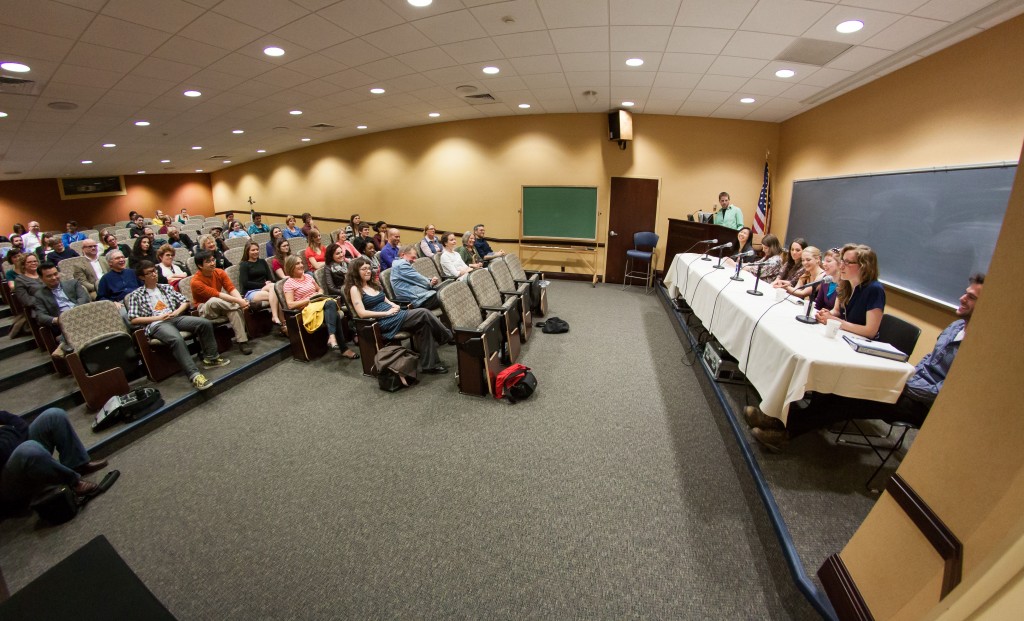
After hosting and moderating a panel discussion with the seven artists whose work is on display in the 28th Annual Student Exhibition I heard a few comments that people wanted to know a little bit more about what I had to do with the show. As curator of the exhibition I tried to take a back seat and let all of the attention fall on the artists, but perhaps that wasn’t so fair. In the panel discussion I asked question after question to these artists and sat back and watched as they answered me and addressed their thoughts to the audience, I had it kind of easy. Nobody threw me though questions or prodded me about my work. So here goes my take on the process of putting together the student exhibition:
 Briefly, the act of curating can be boiled down to making the decisions a gallery needs to make in order to display a group of artworks. These decisions are: how should we arrange the space, where should each artist’s work go in the space, how should we hang/display/present each work of art, is there a theme to the show, how do we explain/show the audience what we are doing by presenting the work of these artists together, how do we promote the show, how do we light the show, etc.
 This was my first time curating a show with living artists. To be blunt, dead artists are easy to curate because they don’t really have a say about the decisions I make displaying or writing about the work. Living artists are tricky because you need to be sympathetic to everybody’s wants, hopes, particularities, maybe even egos.
This exhibition was easy for me because I had less of a say about whose work was to be shown. I had to show the work of the Senior Studio majors in the Senior Projects course and the work of the Department of Art and Art History’s Graduate Assistants. For the Senior’s side of the exhibition I did not want to cut work, but rather I wanted them to be able to include all of the work that they produced specifically for that course. Essentially that course was designed to give these artists the opportunity to build a large and cohesive body of work, unlike traditional courses where students produced unrelated projects in different mediums/styles. So I said bring all of your work to the gallery and we can figure out how to arrange them all in an interesting way. For the Graduate works I had to be specific in choosing what to include because they all have large bodies of work already. To decide what to include I asked that they bring their most recent works, ones they hadn’t had the opportunity to show in a public space.
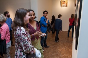 From there the rest of the work was straight forward. I talked with each artist about the spaces we could display their work and the arrangement of their work on the wall on in the space of the gallery. As curator I also had to figure out a number of logistical details like: how to properly hang Hannah Roman’s paintings on the wall so they actually tilted down at the viewer, or arranging for the best projector situation to use from Christina Huang’s video work, and tracking down old furniture to help create Anikke Myers’ faux living room installation. But these types of things were fun and challenging and I really enjoyed the experience.
 That is essentially the type of work that I, as curator, put into the exhibition. Feel free to drop comments or questions below and I’d love to respond to them! And like a good curator, I’d encourage all of you to come on by the Samek until May 2 to check out the exhibition!


